Shawn Vieth Landscaping
PROJECT TYPE
Branding
CLIENT:
Shawn Vieth
INDUSTRY:
Landscaping
Overview:
Confession: I'm a bit of a landscaping nerd. I'm not sure how it started—maybe just being a homeowner?
Because of the forever blurring between personal and professional, I've had the honor of designing a few logos and websites for landscapers, and the latest one I created for Shawn Vieth is by FAR my favorite.
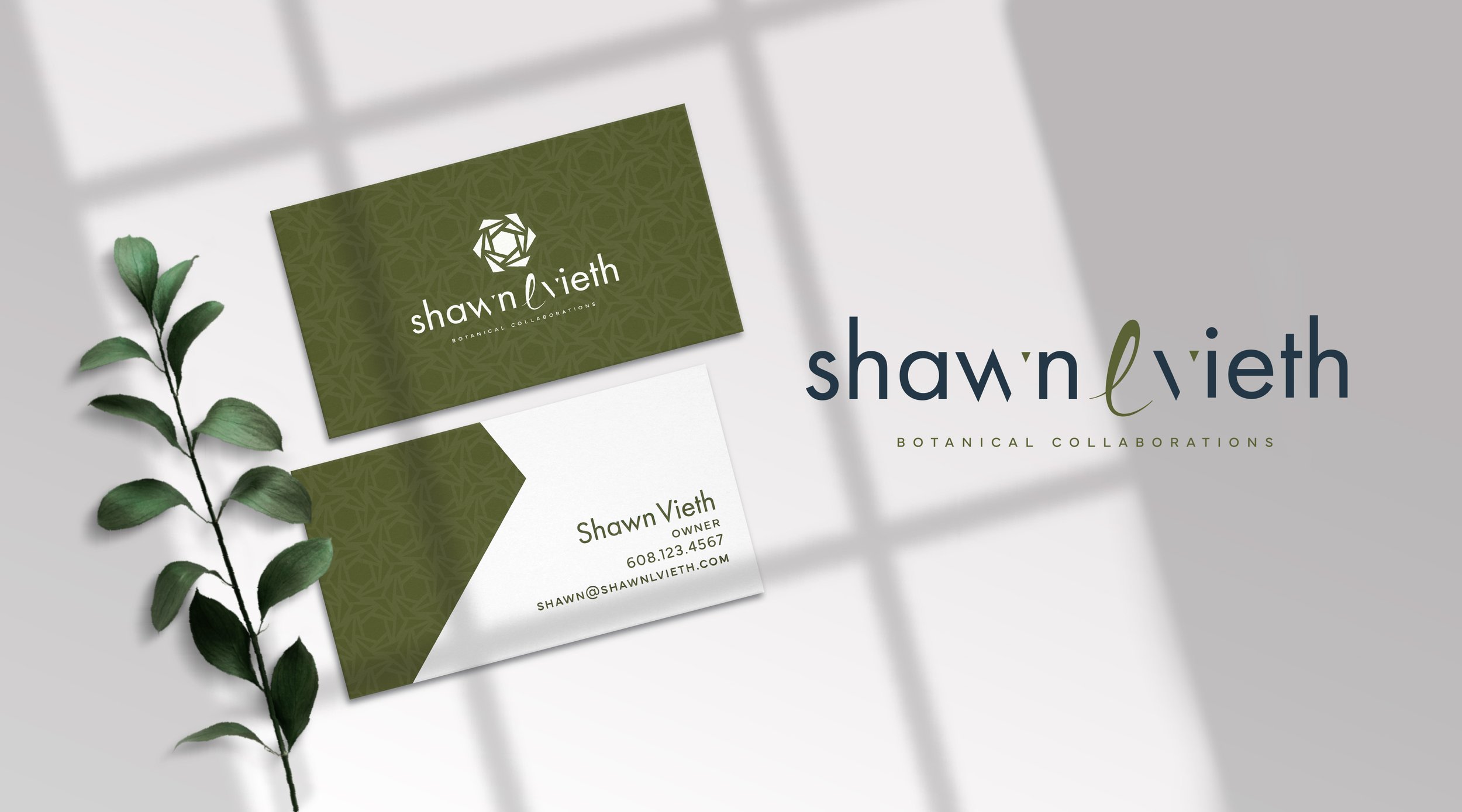
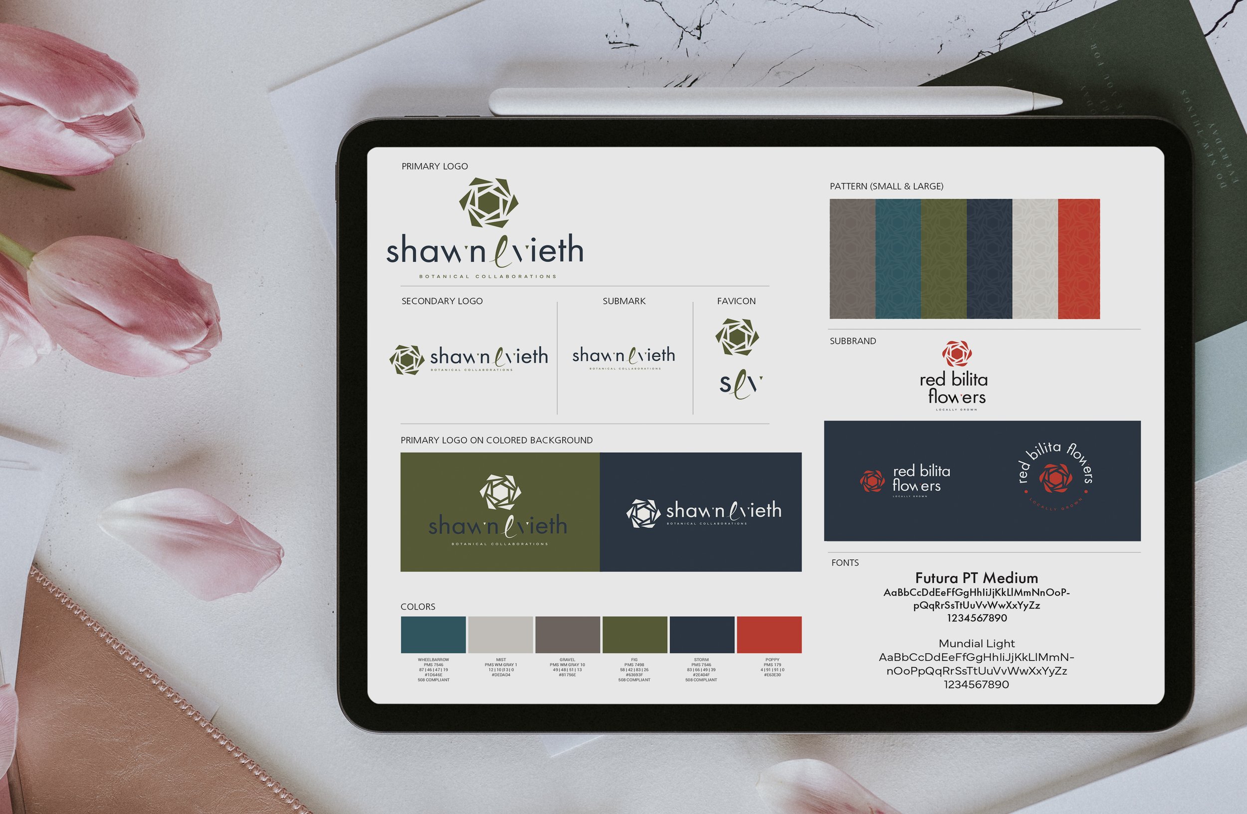
Let’s talk colors first. The tones of clay and blue might be a bit unexpected, but they’re by design: blue represents not only sky and water (both elements that are important to maintain the landscape!) but also open spaces, freedom, intuition, and inspiration. These are enhanced by the warm brown, which evokes feelings of warmth, security, and earthiness.
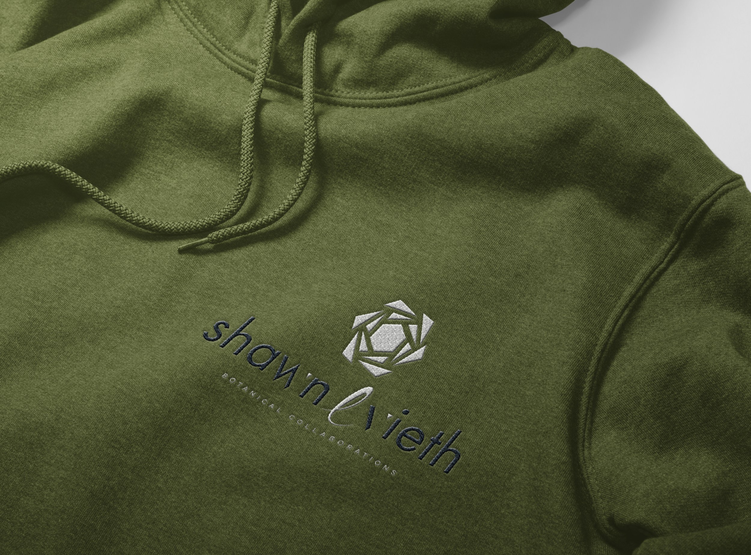
Next, the logo mark. We design the angles of the “hens and chicks” succulent piece you see here to balance perfectly with the serifs of Shawn’s font. The crisp angles tie together in the “w” and “v” of her name. And yet, the “l” of her middle initial breaks up the design with a bit of elegance and femininity.
What I love most is that we were able to brand the other element of her business—Red Bilita Flowers, her flower bouquet subscription service—in a way that can certainly stand alone, but is right at home under the umbrella of her botanical brand. This brand mirrors the parent branding, but with subtle differences: we concentrate on the poppy and storm colors of her brand palette here, and the angle of the succulent is switched out for more rounded corners, giving it more of a flower feel.
I so loved working on this mini “house of brands.” Thanks for being such a trusting client, Shawn!