Quinley Does Hair


Overview:
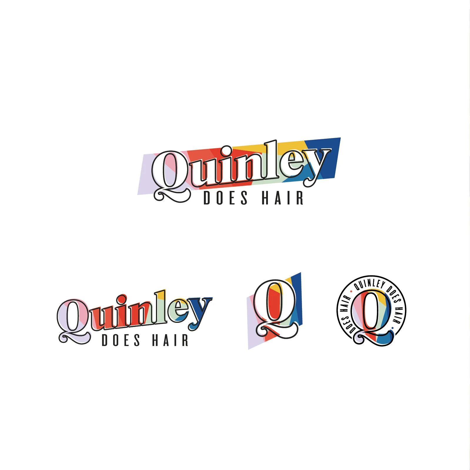
Solopreneur, Quinley Outerbridge came to me for branding of her brand new salon — which of course needed to fit her personality and style. Edgy, quirky and bright. There is also an alignment with the LGBTQ+ community that makes up a large portion of the stylist community. While not the exact colors, this palette is meant to be a visual representation of Quinley’s business ideals and assure that all are welcome.
Quinley’s branding features and offset typography style that adds a touch of edge to the branding as well as an opportunity for visual interest. The bright color palette is the most extensive palette I’ve ever suggested to a client with a total of 8 primary colors and 3 secondary colors to round things out. The use of the stained glass pattern continues the stylistic coming together feel while also showcasing those bright bold colors.
Overall, this branding aligns perfectly with the experience one can expect from Quinley as she continues her journey as a small business owner.