Brain Injury Association of American: Luminary of the Year


Overview:
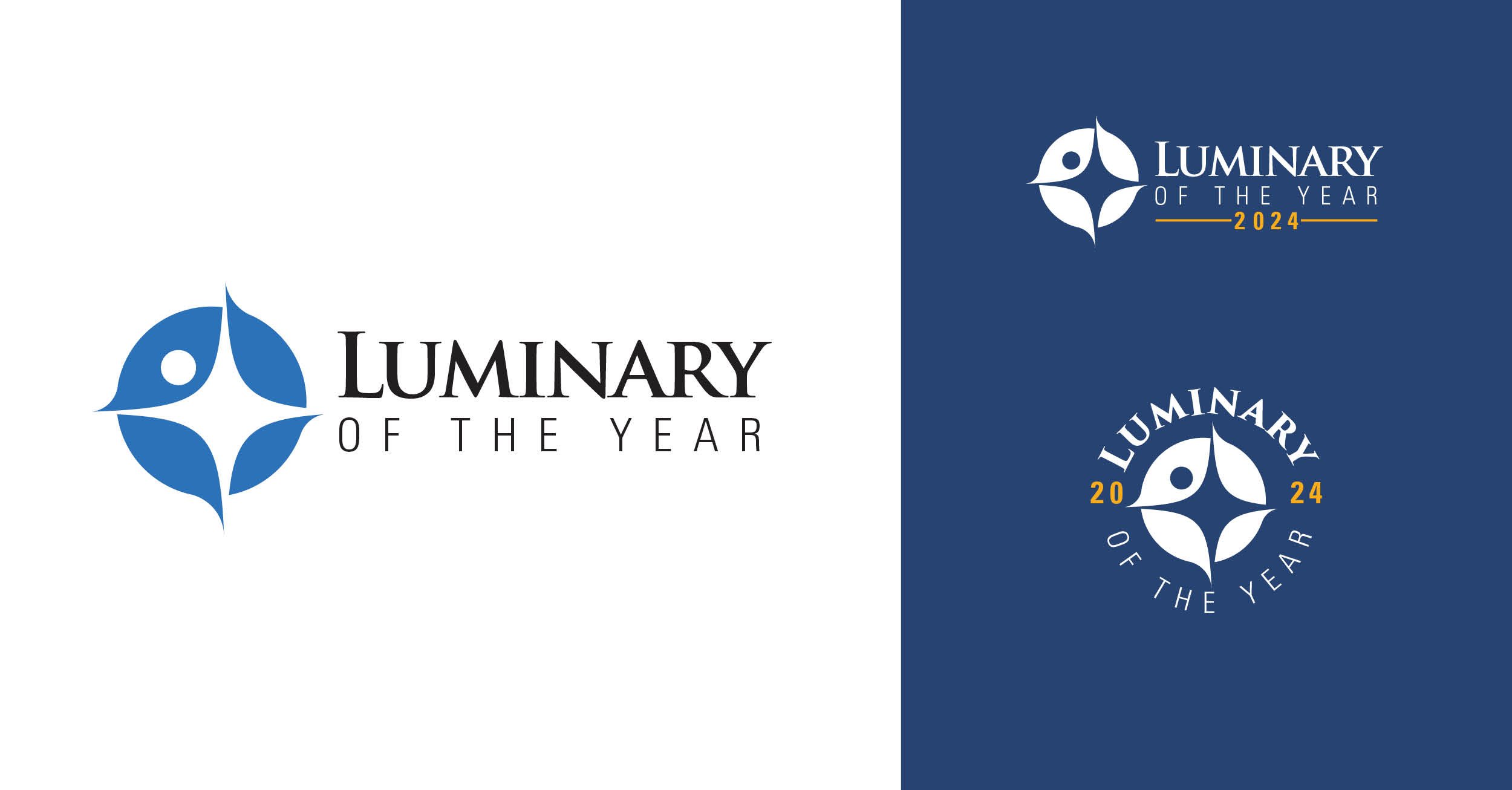
When Brain Injury Association of America's came to us for the branding of their "Luminary of the Year" award our mission was clear: infuse uniqueness while aligning with BIAA's overall branding.
Like many of our designs, this concept centers on the dual meaning of the star shape and human outline within the emblem to highlight the human and visionary aspects of the award.
The Starry Concept: Our logo isn't just a star; it's a celebration of the human spirit. The star shape intertwines with a human outline, capturing the essence of both the award and the visionary recipients.
Energetic Vibes: Ever heard of a hypocycloid or Asteroid-like shape? Well, it symbolizes energy, and we added a dash of movement in the negative space for that extra oomph. We wanted the logo to radiate positivity and forward momentum.
Spotlight on You: We threw in a simple circle to create a dual meaning. Not only does it add a touch of sophistication, but it also represents a person standing in the spotlight. Because, let's face it, the award winners deserve their moment!