Alliance Foundation Annual Report and Microsite


Overview:
Every design agency has a dream client who says, “We trust you—let’s try something different.” For us, one of those clients is the Alliance Foundation.
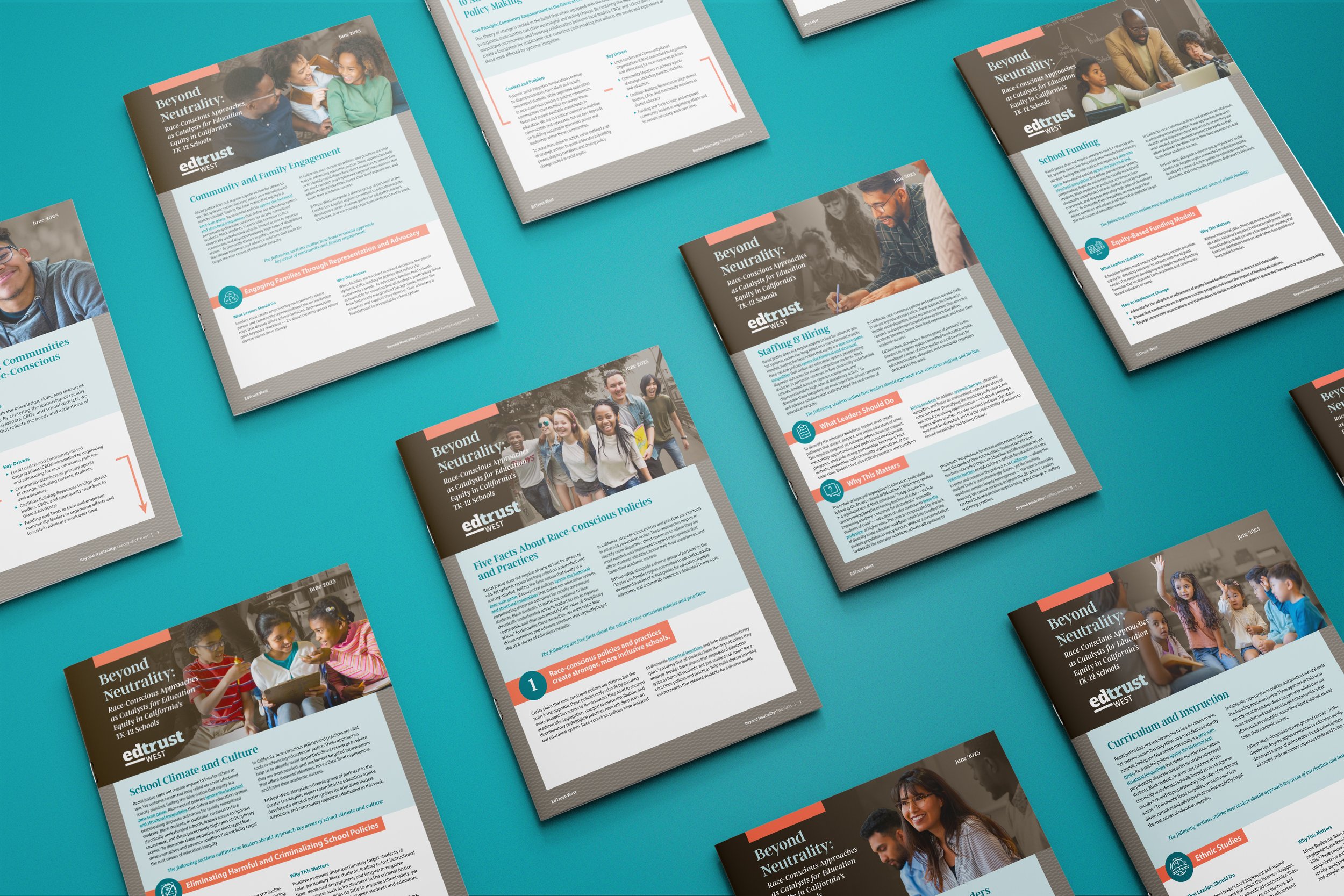
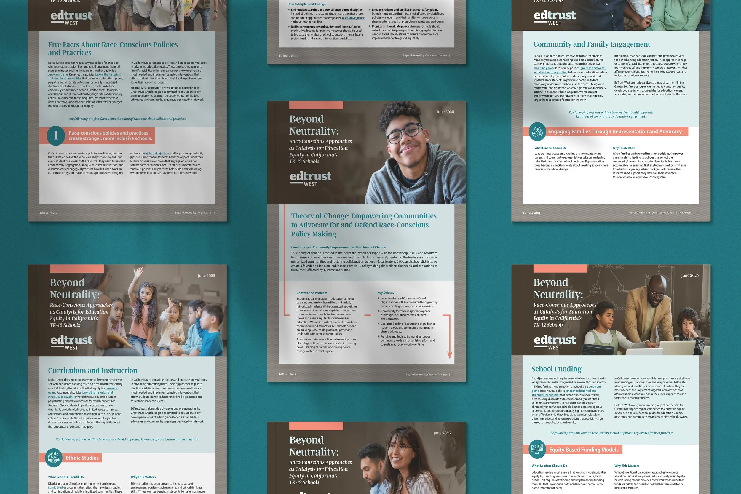
This year, they wanted to make it so that they were truly accessible with their theme—"The Light Ahead"—and their storytelling around that theme. Part of that goal meant reimaginging their usual annual report as both a physical and digital experience.
That theme became our North Star when it came to design. Not only does it literally speak to the Alliance Foundation's commitment to illuminating opportunity and guiding students forward even when the path isn't always clear, it also showed up in our design choices: the warm gradients, the intentional use of white space, and the simple yet striking photography that shows the impact of the organization. Each story glows in its own quiet way.
The printed report introduces several scholar and alumni stories, in addition to sharing key programs and initiatives from the Foundation. Each story is accompanied by a QR code that takes readers to a corresponding microsite. There, the stories expand into full-length narratives and impact data.
One of the challenges we're always looking to solve is the delicate dance of print and digital. Say too much in a print piece and you run the risk of overwhelming your audience, but making your audience read everything from a screen isn't ideal, either. We love how the report and microsite form a single, continuous story about what the Alliance Foundation does, who they impact, and why it matters.